Who's at the peak?
COVID-19 has hit some countries far harder than others, though differences in the way infections are counted locally make it impossible to make a perfect apples-to-apples comparison.
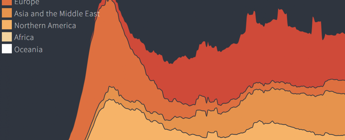
We want to know where infections are trending up or down relative to the size of the outbreak in each country. So in these charts we use a rolling 7-day average of the new infections countries report each day and compare where that average is now to where it was at its peak.
The percent of that peak a country currently reports gives us a better idea of how far it is from containing the spread of the virus relative to the worst days of its outbreak.
Related tag